

TL;DR
- Google now indexes the mobile version of your site first, so what users see on their phones determines your rankings.
- Build for people and not tools. Test your site on real phones, not just emulators. Let users click around and catch issues that audits may miss.
- Speed is everything. Compress images, lazy-load videos, defer scripts, use a CDN, and monitor Core Web Vitals (LCP, FID, CLS).
- Design responsibly. Don’t shrink desktop layouts. Design for thumbs, clear fonts, and small screens.
- Optimize your website for intent. Mobile users search differently, using short, local, and “right-now” queries. Add FAQ schema, click-to-call, and map links.
- AMP isn’t a must anymore. Focus on Core Web Vitals and responsive speed instead, unless you’re running a huge news site on slow networks.
- For local SEO, keep your NAP data consistent, update your Google Business Profile, and make every CTA tappable.
Introduction
In a world where nearly two-thirds of web traffic comes from phones, and Google’s mobile-first indexing now decides which pages earn visibility, ignoring mobile SEO is basically telling search engines you don’t care to compete.
Mobile SEO strategies are the new foundation of performance. As a white-label partner helping agencies since 2010, we’ve seen firsthand how small changes like shaving milliseconds off load time, fixing content mismatches, cleaning up code, etc, can completely flip performance metrics.
In this guide, we’ll share how we approach mobile-first SEO, the exact strategies and frameworks we use to drive real results.
Why Mobile First is Non-Negotiable
Back in 2015, we all laughed nervously about “Mobilegeddon.” It sounded like yet another exaggerated Google warning, until it wasn’t.
That update marked the start of a new era where Google began judging websites by their mobile versions.
Today, mobile SEO is a baseline!
Google now uses mobile-first indexing, which means your mobile site determines how your entire website ranks. If that version is slow, disorganized, glitchy, not readable without zooming, or missing content, it doesn’t matter how clean your desktop build looks. You’ll sink in search results.
We’ve seen this play out both in data and in daily user frustration.
The impact of response latency in the mobile web search study shows that even a 7–10 second delay on mobile makes users feel drained and impatient. Interestingly, it was even found that improving how fast a page appears to load (the “perceived speed”) can be as powerful as cutting down actual load time. That’s why design tweaks, skeleton screens, and early rendering matter so much.
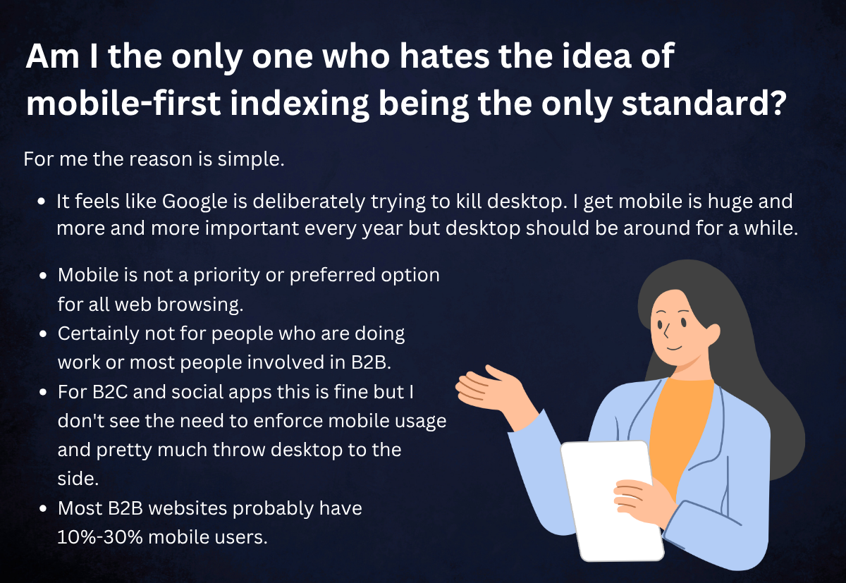
But beyond data, the internet is full of marketers still wrestling with this shift. We see people argue that Google’s obsession with mobile felt like “killing the desktop altogether.” They argued that not every user prefers browsing on a small screen, which, fair point, is true for some industries.
But, come to think of it:
If your mobile SEO is spot on, chances are that your desktop SEO will fall neatly into place. But not always the other way round.

Now, here are some mobile-first SEO strategies every agency should follow:
1. Build for People, Not for Tools
Before diving into code audits, CSS tweaks, or schema debates, start with one simple question: Would a real person enjoy using this site on their phone? That’s your north star.
When our team takes over a project, we often see this pattern: the site feels fast and smooth on an actual phone, yet automated tools label it as “poor.” This happens because tools like PageSpeed Insights simulate a worst-case mobile scenario, a low-end device with poor connectivity, not the high-performance phones most users rely on today.
While these metrics are useful for identifying technical bottlenecks, they often exaggerate the problem and paint a misleading picture of real-world performance.
At the end of the day, websites are built for people, not for testing tools. When you prioritize usability and human experience first, the technical metrics tend to follow naturally.
What you should do:
- Walk the site on real devices (low-end Android, midrange iPhone)
- Use emulators only for debugging, not for final judgment
- Get real people to test it. Ask users to click, scroll, and navigate. They’ll often spot small frustrations or design glitches that tools completely miss
2. Speed is the Backbone
Forget traffic rules for a moment, there’s another kind of speed that can make or break your results. Slow sites lose users.
Google’s research shows that 53% of mobile visitors leave if a page takes longer than three seconds to load. That’s half your audience gone before they even see what you offer.
That’s why we follow a clear performance checklist that delivers measurable results:
- Lazy-load images and videos below the fold to prioritize what users see first
- Use next-gen formats like WebP or AVIF for faster image delivery without compromising quality
- Minify CSS and defer JavaScript so non-critical code doesn’t block rendering
- Optimize server response time with high-performance hosting and a modern tech stack
- Leverage a CDN to distribute heavy assets and deliver content quickly to users anywhere in the world
We also continuously track Core Web Vitals, LCP, FID, and CLS, because Google now ranks based on real user experience, not simulated test results.
When performance becomes part of your build process, not an afterthought, every site you deliver loads faster, ranks higher, and converts better.
3. Design Responsively, Not Reactively
“Responsive” doesn’t mean “shrink desktop to phone.” It means adapting content to the mobile context. We often tell our partners:
“If it’s a 3′ screen with one thumb, make sure all buttons and calls to action are tappable without zooming.”

Sometimes, when we inherit a site, a simple fix, like fixing a 28 px tall button which as overlapped nearby text, recovers dozens of mobile conversions.
4. Optimize for Mobile Search Intent
Mobile users are direct. They want answers quickly. So your SEO approach must shift to cater to them. Make sure you rewire your content strategy bearing these in mind:
- Use short, conversational keywords (“best taco near me”, “SEO tips mobile”)
- Add FAQ schema for mobile SERP snippets
- Use click-to-call, map links, and direction features
- Prioritize content that addresses pain + want (e.g., “Why is my site slow on phone?”)
Turning a blog about “why mobile speed matters” into a mobile snippet + FAQ alone can boost click-through rate from search results significantly.
5. Use AMP Only Where It Adds Value
AMP was once the holy grail for mobile speed. Short for Accelerated Mobile Pages, AMP is a simplified web framework created by Google to make mobile pages load almost instantly. It strips down unnecessary code, caches pages on Google’s servers, and prioritizes speed over heavy visuals or scripts.
In the past, AMP helped news sites and blogs rank better on mobile search. But since 2021–2022, Google no longer gives AMP content special treatment.
Now, you can achieve the same (or better) performance by focusing on Core Web Vitals, responsive design, and lightweight builds, without needing to use AMP at all. But AMP isn’t totally dead.
You can turn to accelerated mobile pages only when:
- You’re a news site with huge content churn
- You’re targeting markets with very slow mobile networks
Otherwise, focus instead on trimming assets and improving Core Web Vitals. In many of our projects, going all-in on AMP added overhead without enough reward.
6. Strengthen Your Local Mobile SEO
Because, according to Uberall, 82% of mobile search users have used their phone to look up local businesses, this is low-hanging fruit. Always audit local signals by ensuring:
- Consistent NAP across all directories
- Google Business Profile is updated with images, posts, and FAQs
- Encouraging real customer reviews
- Local schema (for address, opening hours, reviews)
Just adding Maps directions + phone clickability in a single city can help you see an increase in phone calls from mobile users within weeks.
7. Audit, Adapt, and Evolve Continuously
Mobile SEO isn’t something you fix once and tick off. Things break, plugins update, you add content weekly, browsers evolve, and all of it affects how your site loads and behaves on various phones.
That’s why it pays to audit every single month. Not quarterly. Not when traffic drops.
Here’s what our monthly mobile SEO audit checklist looks like in practice:
- Compare mobile vs desktop rankings in Google Search Console to spot drops early
- Review Lighthouse and PageSpeed scores against real-user metrics (CrUX); don’t rely only on lab tests
- Check analytics for mobile bounce rate and exit pages. Are users leaving where they shouldn’t?
- Walk through the site manually to find broken tappables, overlapping CTAs, or hidden text
- Validate structured data and schema to be sure nothing broke during updates
Most teams skip this because it feels repetitive. Your site is a moving target. Keep auditing, keep fixing, and you’ll stay ahead of both Google and users.
Also Read: How to Choose a White-Label SEO Partner: Complete Evaluation Framework
Final words
We believe that mobile-first SEO is not a trend but how the web works now.
If your agency wants to scale without compromising quality, mobile optimization must be built into every deliverable you create. From technical performance to user intent, everything starts with how real people experience your clients’ websites on their phones.
When you’re ready to offload mobile SEO execution and still deliver excellence to your clients, partner with us through our White Label SEO services.
FAQs
1. Do we need a separate mobile site anymore?
No. Separate “m.domain.com” sites are outdated and messy to maintain. Google prefers responsive design, meaning one site that adapts fluidly to every screen. If you’re still managing two versions, you’re doubling your work and confusing search crawlers. Invest that effort in improving your responsive build and Core Web Vitals instead.
2. Can a site with a low mobile PageSpeed score still rank well?
Absolutely, but take it as a warning sign. Still, if users are bouncing, fix it. A slow-loading mobile page is bad for SEO and trust. However, at Justwords Digital, we’ve seen plenty of websites ranking on page one with what Google calls a “poor” mobile score. PageSpeed is one signal. What matters more is how real people experience your site. You can think of PageSpeed like a thermometer. It’s useful to monitor, but not the whole health report.
3. How can I measure real user mobile experience (not just lab data)?
Use field data from Google Search Console’s Core Web Vitals report or Chrome User Experience Report (CrUX). These capture real metrics from users’ actual devices and connections. Pair that with heatmaps or session recordings (Hotjar, Microsoft Clarity) to watch how mobile users scroll, tap, and exit; it’s the best way to catch real-world friction.
4. Should we create shorter content for mobile users?
Not necessarily shorter, just more scannable. Break long-form posts into small sections with collapsible headings, numbered lists, and visuals. Google doesn’t penalize long content, but mobile users reward clarity. A well-structured, visually light long read performs better than a short wall of text.
5. Should we use different keywords for mobile SEO?
Yes, sometimes. Mobile users often search differently, such as using shorter phrases, local intent, or voice queries. Tools like Google Search Console or Ahrefs’ “Devices” filter can show mobile-specific keyword trends. You can tailor title tags or meta descriptions accordingly.


